| 일 | 월 | 화 | 수 | 목 | 금 | 토 |
|---|---|---|---|---|---|---|
| 1 | 2 | 3 | 4 | |||
| 5 | 6 | 7 | 8 | 9 | 10 | 11 |
| 12 | 13 | 14 | 15 | 16 | 17 | 18 |
| 19 | 20 | 21 | 22 | 23 | 24 | 25 |
| 26 | 27 | 28 | 29 | 30 |
- 레이아웃모델
- iterationprotocol
- 자바스크립트문법 #노마드코더 #
- flex특징
- ime일본어처리
- 자바스크립트sort함수
- flexgrid차이점
- Realtime
- 이터레이터프로토콜
- DestructuringAssignment
- realtimeapi
- AI
- interable
- tts-1
- chatGPT
- whisper-1
- flex사용법
- ES6란
- 이터러블프로토콜
- 이터레이션프로토콜
- OpenAI
- 바닐라JS #바닐라JS로크롭앱만들기 #
- ime란
- 자바스크립트filter
- 자바객체 #자바인스턴스 #객체와인스턴스차이점
- 음성채팅
- gpt-4o-transcribe
- JAVA #Swing #자바스윙 #스윙
- javascript문법
- 배열재정렬함수
- Today
- Total
끄적끄적 개발기록
< Flex 정리 > 본문
flex는 레이아웃 모델!
flex의 특징
- 기본이 inline-block이다!
- direction에 따라 justify 방향이 달라지다! (상대적이다)
- flex는 서로 다른 크기의 화면과 기기에서도 HTML 요소들이 자동으로 재정렬되어, 웹 페이지의 레이아웃을 언제나 똑같이 유지할 수 있다!
- Flexbox was introduced in 2009 as a new layout system, with the goal to help us build responsive web pages and organize our elements easily
flex 사용법
- flex는 부모와 자식이 있어야한다!
- flex는 부모를 위한 속성과 자식을 위한 속성들로 나눠져 있다!
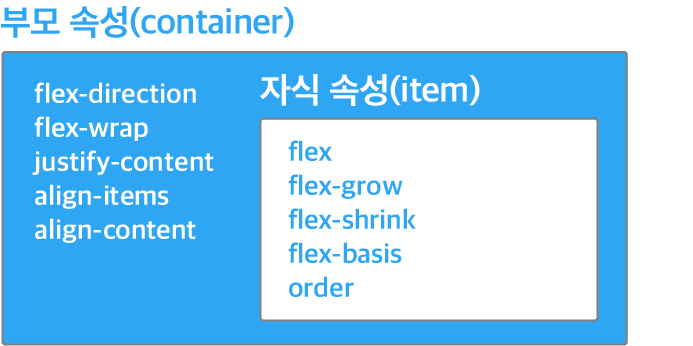
부모(container)에게 주는 속성
1. display
- 블록 타입이면 display 속성을 flex로 인라인 타입으로 하려면 inline-flex로!
- flex의 출발점은 부모에게 display: flex;를 주는 것으로 시작!!
- ****flex가 적용된 부모 바로 아래 자식만 적용됨! 자식의 자식은 적용이 되지 않는다!!
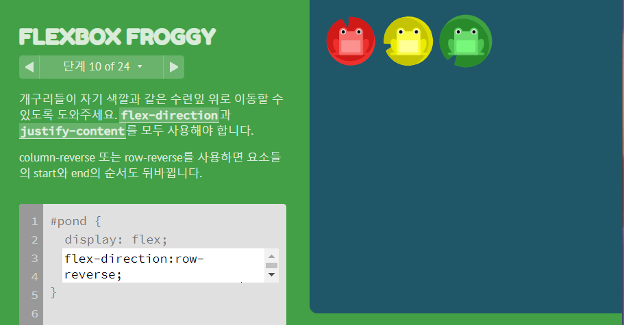
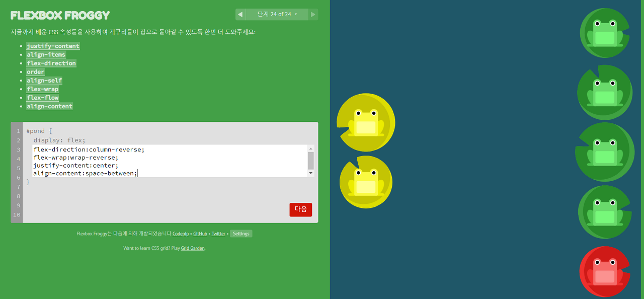
2. flex-direction

3. justify-content

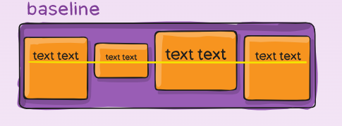
4. align-items

https://css-tricks.com/snippets/css/a-guide-to-flexbox
A Complete Guide to Flexbox | CSS-Tricks
Our comprehensive guide to CSS flexbox layout. This complete guide explains everything about flexbox, focusing on all the different possible properties for the parent element (the flex container) and the child elements (the flex items). It also includes hi
css-tricks.com
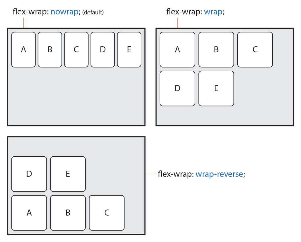
5. flex-wrap
6. flex-flow
- flex -direction 과 flex-wrap의 합친 모습
.container {
  flex-flow: column wrap;
}
7. align-content
align-content는 여러 줄들 사이의 간격을 지정하며, align-items는 컨테이너 안에서 어떻게 모든 요소들이 정렬하는지를 지정. 한 줄만 있는 경우, align-content는 적용되지 않음!

***플렉스 컨테이너는 언제나 하나 이상의 플렉스 요소를 포함해야 한다.
8. gap
- The gap property controls the space between flex items

.container {
  display: flex;
  gap: 10px;
  gap: 10px 20px;  */* row-gap column gap */*
	row-gap: 10px;
  column-gap: 20px;
}
자식(item)에게 주는 속성
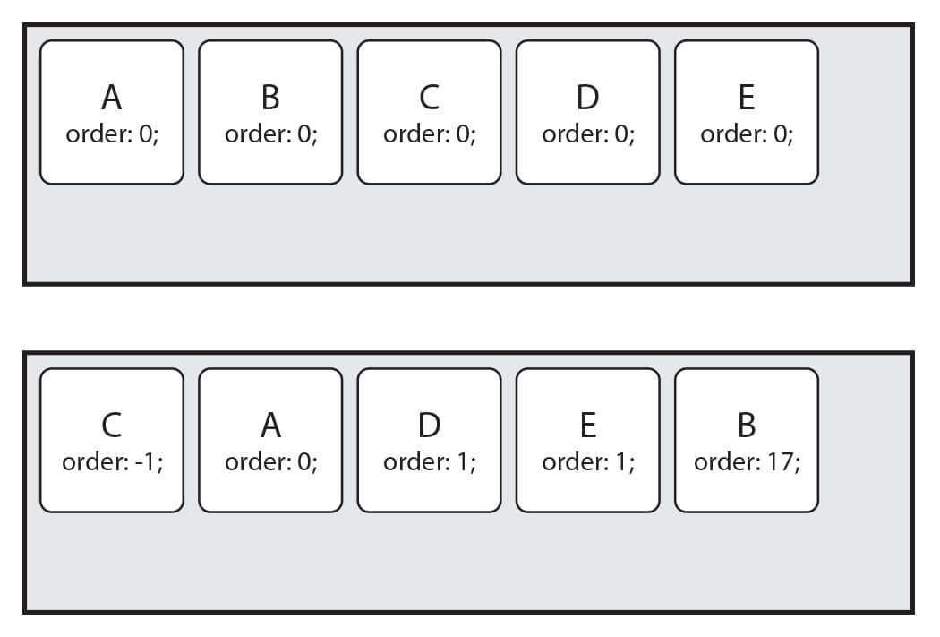
1. order
- Item의 순서를 설정
- Item에 숫자를 지정하고 숫자가 클수록 오른쪽에 있ㅇ다
- 음수가 허용
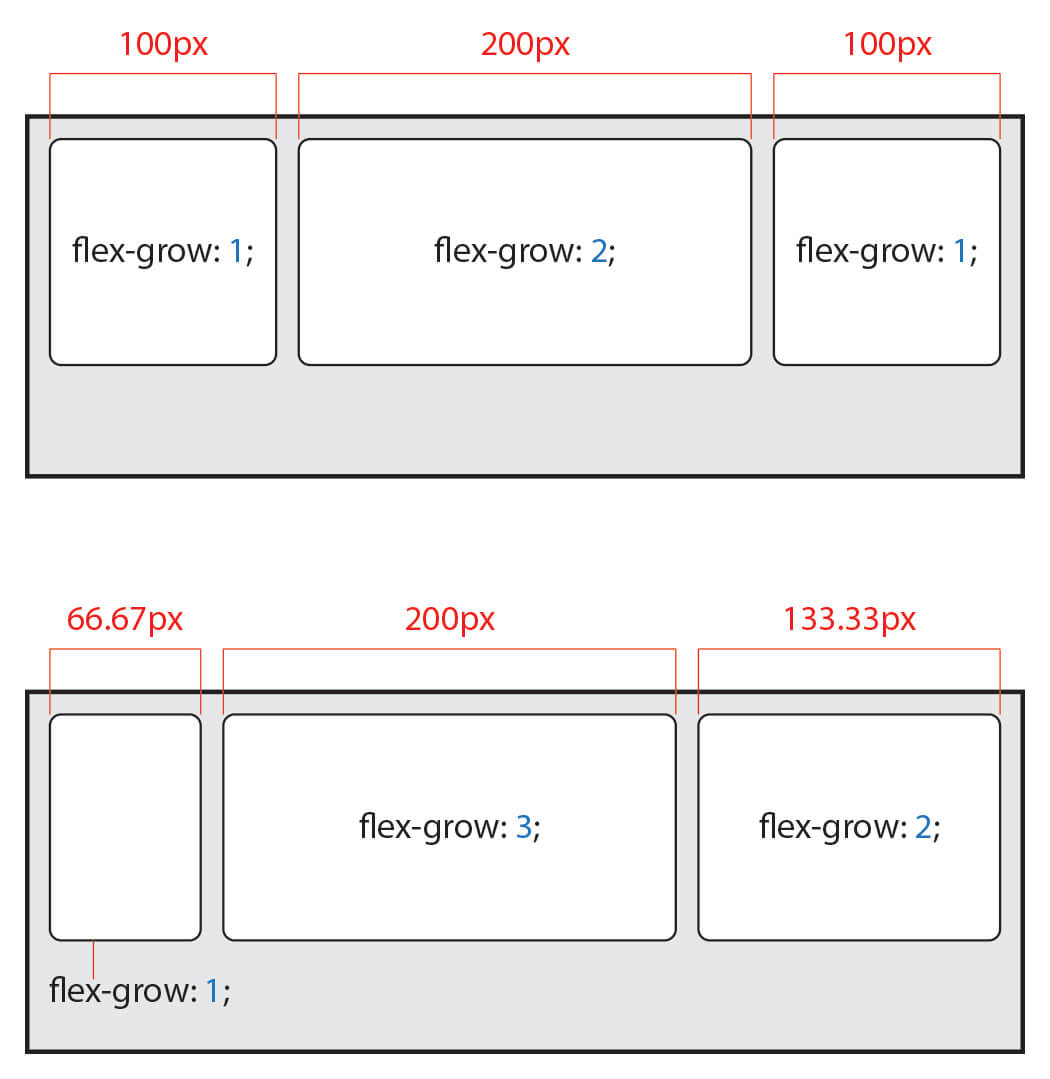
2. flex-grow
- Item의 증가 너비 비율을 설정.
- 숫자가 크면 더 많은 너비를 가진다.
3. flex-shrink
- Item이 감소하는 너비의 비율을 설정
- 숫자가 크면 더 많은 너비가 감소

4. flex-basis
- Item의 (공간 배분 전) 기본 너비를 설정
- 값이 auto일 경우, width, height 등의 속성으로 item의 너비 설정 가능
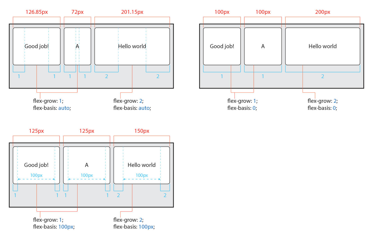
5. flex
- item의 너비(증가, 감소, 기본)를 설정하는 단축 속성
**.item {
	flex:1 1 20px ;  /* 증가너비 감소너비 기본너비 */
  flex: 1 1 ;  /* 증가너비 감소너비 */
	flex : 1 20px ;
	/* 증가너비 기본너비 (단위를 사용하면 flex-basis가 적용됩니다) */
}**
flex: 1; 로 작성하면 flex-grow: 1; 과 같다.
| 값 | 의미 | 기본 값 |
| flex-grow | Item의 증가 너비 비율을 설정 | 0 |
| flex-shrink | Item의 감소 너비 비율을 설정 | 1 |
| flex-basis | Item의 (공간 배분 전) 기본 너비 설정 | auto |
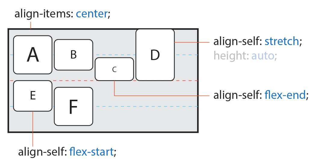
6. align-self
flexbox 공부할 수 있는 곳
flex와 grid
- Flexbox layout is most appropriate to the components of an application, and small-scale layouts, while the Grid layout is intended for larger scale layouts.
- Flexbox is a one-dimensional layout method whereas Grid Layout is a two-dimensional layout method.
- If we create a very similar layout using Grid, we can control the layout in both rows and columns.
- The most important thing to know is that flexbox is one-dimensional, while CSS Grid is two-dimensional. Flexbox lays out items along either the horizontal or the vertical axis, so you have to decide whether you want a row-based or a column-based layout.
- In the other hand, CSS Grid lets you work along two axes: horizontally and vertically. Grid allows you to create two-dimensional layouts where you can precisely place grid items into cells defined by rows and columns.
https://webdesign.tutsplus.com/articles/flexbox-vs-css-grid-which-should-you-use--cms-30184
http://tcpschool.com/css/css3_expand_flexbox
코딩교육 티씨피스쿨
4차산업혁명, 코딩교육, 소프트웨어교육, 코딩기초, SW코딩, 기초코딩부터 자바 파이썬 등
tcpschool.com
'개발 > Frontend' 카테고리의 다른 글
| url 상태관리 (0) | 2024.07.15 |
|---|---|
| moduleResolution이란 (0) | 2024.06.08 |
| Button 태그에 type을 명시하면 좋은 점 (0) | 2023.07.25 |
| 브라우저 렌더링 엔진 동작과정 + 웹페이지 속도 최적화 (0) | 2023.03.13 |
| 🎵바닐라 JS로 크롬 앱 만들기🎵 (0) | 2022.03.21 |

